One of the rules of good scenic photography is to place
the subject of the picture on an imaginary line, about
1/3 of the way into the picture, facing the action.
In other words, if you divided your picture by thirds
vertically and thirds horizontally, your subject should
ideally be on or near one of those division lines. It's
even better if the subject is on or near the intersection
of two division lines. The subject should always be
facing into the picture, especially if the picture portrays
some sort of action (like fishing).
That rule is so steadfast that many cameras have a grid
on their view screen that shows the lines so the
photographer can place his/her subject where it belongs.
Supposedly, following that rule results in better pictures
that are more pleasing to the human eye. You can violate
the rule if you want, but keep in mind that many
publishers stick to the rule like it was gospel.
Fortunately, the rule doesn't apply to most macro shots
and some fast-action shots. It's also ignored most of
the time in instructional photography where your
attention is focused on the instructional features of
the photo. You might think the rule is ignored in
portrait photography, but if you look at where the
eyes or head are placed in the picture, you'll see
that most photographers adhere to the rule then too.
What does this have to do with this week's subject?
Well, we're going to start with a picture that applies
those rules. In fact, since the picture complies with
those rules, it could be a candidate for a cover shot
on a magazine someday. And, by following the rules,
we have enough room to add extras to the picture without
crowding the theme out of view. Keep in mind, any
composite photo you create should start with a good
picture and grow from there.
Continuing with the theme from last week, we'll be working
on more layering techniques, but this time we'll work with
something other than a lasso or magic wand. Many photo
imaging software packages allow you to cut, crop or copy
a portion of a photo in a geometric shape like a circle,
ellipse, square or rectangle. Let's try that and see
what we can come up with.
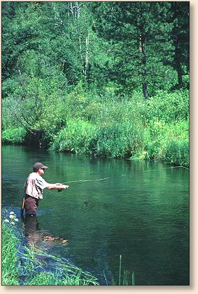
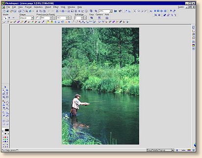
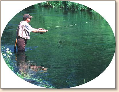
Here is a picture of my friend Steve. Steve is a
professional photographer and a pretty good fly-fisher.
Steve taught me many of the photography skills I've learned,
especially scenic photography, and much of what he knows
about flyfishing was learned from me. I think it was a
fair trade.
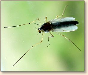 Steve is fishing a midge hatch, and I'd like to show
that idea somewhere on the picture of him fishing.
I'm a pretty good macro photographer. Actually, I'm
a bit better than Steve in that area of photography
(he didn't teach me everything I know), so I do have
a few photos of midges that would make him green with
envy (maybe).
Steve is fishing a midge hatch, and I'd like to show
that idea somewhere on the picture of him fishing.
I'm a pretty good macro photographer. Actually, I'm
a bit better than Steve in that area of photography
(he didn't teach me everything I know), so I do have
a few photos of midges that would make him green with
envy (maybe).
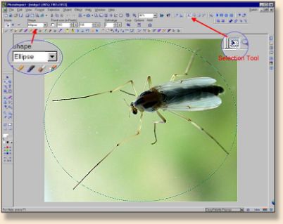
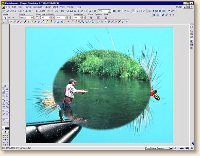
First I need to capture that midge so I can use it in
the other picture. Using the selection tool in an
elliptical pattern, I draw an ellipse around the midge
and copy my selection to use in the other picture.
Next I open the picture of Steve
and paste the outlined picture of the midge as a photo
object onto Steve's picture.
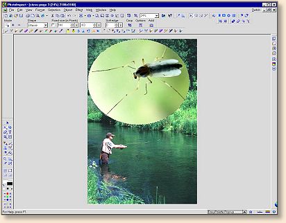
Then I move the midge into the position I want, size it
to fit, and make it transparent.
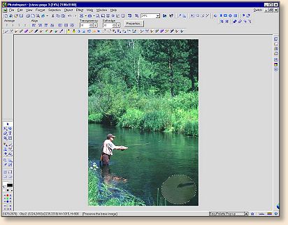
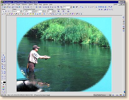
I can do that as many times as I want, and with any
picture I want. For instance, I can copy Steve from
this picture and paste him back into the picture.
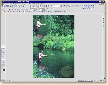
And, I can replace the midge with the copy of Steve.

That's all fine, but we really haven't done anything
very artistic. Let's use those skills we just learned
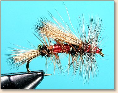
and do something a little more artistic. We'll start
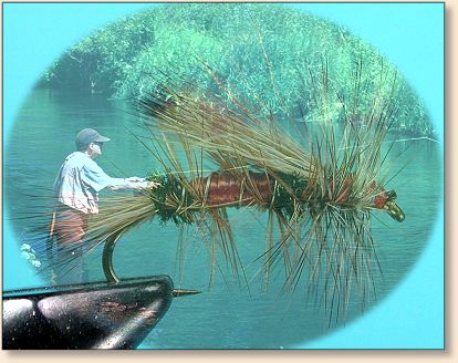
with a picture of a fly in the vise.
Then copy Steve out of the other picture and place him
on top of the fly.
Size him to fit into the frame of the fly picture.
And make him transparent.
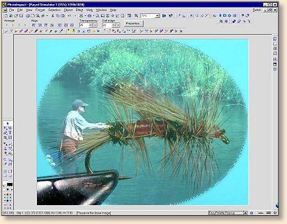
That's pretty artistic. Notice that we followed the
rules of subject placement fairly close when we placed
Steve in this picture? His hands intersect the fly
about 1/3 of the way into the picture.
What would it look like if we layered the photo the
other direction with Steve's picture under the fly?
Would it look any different? Let's find out.
First we take the cutout picture of Steve and place it
onto a blank white background that is just big enough
for his picture.
Then we place the picture of the fly over Steve's picture
and make it transparent.
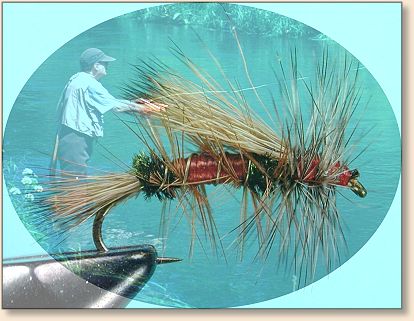
Did you notice that the picture placed on top of the
other picture is the sharpest part of the final image?
Look again.
Here's Steve on another creek on another day with the
same fly placed over his picture. However, this
composite image was created using basically the same
tools in Microsoft's "Picture It Publishing Platinum"
software.
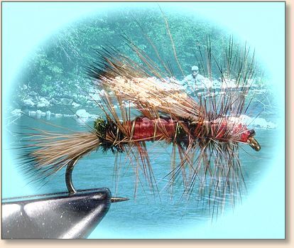
There are obvious differences in the way these different
programs layer images. Every program has its strong points
and weak points. If you only have one program for digital
imaging, you'll have to learn how to get the most out of
that program. However, if you have several programs to
choose from, you can take the best properties from each
program and put them to your best use. In fact, in some
cases, you can manipulate a picture in one program and use
it in another program to create the best possible image.
More on that idea later in this series.
How is your practice coming along? Don't forget we have
a contest coming up in a couple of weeks. See you next
week with more fun things you can do to your pictures.
~ AC
|