+ Reply to Thread
Page 1 of 2 12 LastLast
Results 1 to 10 of 19

Thread: Fly Fishing logo review

  1. #1
    Join Date
    Jul 2009
    Location
    Madison, MS
    Posts
    159

    Default Fly Fishing logo review

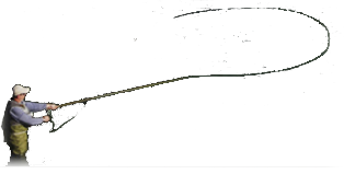
    Not only did my wife hook me up with everything I need to start building my own fly rods, she even made me a logo. She is asking for suggestions/critiques to make it better. Her vision is for me to use this as a decal on the blank of ant rods I build. Let me know what you think.


    JLHarris Logo scriptina font.jpg
    Attached Images Attached Images

  2. #2
    Join Date
    Aug 2002
    Location
    Ames, Iowa, USA
    Posts
    202

    Default

    I like the rod, line, flly and script. I can not figure out what the line between the rod and the name represents.

  3. #3
    Join Date
    May 2002
    Location
    DFW metroplex, TX USA
    Posts
    1,164

    Default

    Bedlam, FWIW my career includes 30+ years in major brand marketing and 15+ years as a marketing consultant. I've reviewed a lot of logos in that time. No brag, just fact: I'd be amazed if you did not instantly recognize some of the logos I've approved.

    I think it is a fine logo, approve it, and have no suggestions to make --unless your name is not J.L. Harris.

    Buy your bride some flowers, give her a kiss and tell her she's done a fine job!

    Brad

  4. #4

    Default

    Quote Originally Posted by djo View Post
    I like the rod, line, flly and script. I can not figure out what the line between the rod and the name represents.
    I had this same exact feeling.

    But it might not look right without it.

  5. #5
    Join Date
    Feb 2009
    Location
    Cresco, Iowa
    Posts
    230

    Default

    A nicely done logo. I think the line just left of the name is line coming off the pole in an abstract, artistic fashion. I doubt the gold trim that outlines the rod and line will be seen when it is reduced to decal size and may just add to the cost of the decal. Still very nice though!

  6. #6
    Join Date
    Jun 2006
    Location
    NE Gwinnett Co., GA
    Posts
    5,937

    Default

    I have seen logos which corporations spent a lot of money for that did not look nearly as good. You have a talented wife.
    Want to hear God laugh? Tell him Your plans!!!

  7. #7
    NewTyer 1 Guest

    Default

    I like the logo but, because of the rod and line being higher than the script and it will wrap around your blank, if you shrink it enough to get the whole label in, would it make the script to small to read. Maybe, if it makes the script to small, you can just use "J L Harris Rods"


    You will have to shrink it to the size you want before you can really make the decision. As is, I like it, it is very artistic. I'm just concerned whether or not you will be able to read the script once it is reduced enough to fit the rod so it doesn't wrap over itself, if that makes any sense to you.

  8. #8
    Join Date
    Jul 2009
    Location
    Madison, MS
    Posts
    159

    Default

    Thanks for all the input and compliments, she will be pleased. We were guessing at the size using some info pulled off the Internet for rod decals. Before ordering decals she will make sure the sizing is correct and make any final changes. She is making it something called a vector graphic so it can be reduced or enlarged with no graphic degradation. The loop coming off the reel is her artistic representation of fly line, turvy got that dead on. I understand where djo and John are coming from as I pointed it out as well, but she explained that logos are artistic representations, not literal which makes sense. How could I argue with a stay at home, mother of three that clearly decided to marry down. There may be some tweaking to color and borders as well, but until it is printed and sized that will have to wait.

    Any opinions on the fly?

  9. #9

    Default

    I took the loop of line at the bottom to represent the line that you hold with your non-casting hand.

    It took me a minute to look at the logo to figure everything out. But that's a good thing. I mean, how many company logos do you take one single glance at.....and that's all.
    With only one glance, the logo get's less than a second of your brain's thought. The longer you look at something, the longer your brain spends time one it...and that's good.

    I like the logo. I think your wife did a great job.

  10. #10
    Join Date
    Aug 2007
    Location
    Havana, Fl
    Posts
    140

    Default

    Hope your rods are as good as the logo, if so, they should be awesome.

+ Reply to Thread

Similar Threads

  1. logo
    By freddyg in forum Fly Anglers Online
    Replies: 3
    Last Post: 11-10-2009, 01:52 PM
  2. looking for book review
    By rookie in forum Fly Anglers Online
    Replies: 6
    Last Post: 04-10-2009, 06:54 PM
  3. After further review!
    By MarkF in forum Warm water Forum
    Replies: 2
    Last Post: 07-29-2008, 03:30 PM
  4. zip cast review
    By flybugpa in forum Fly Anglers Online
    Replies: 12
    Last Post: 04-28-2008, 06:12 AM
  5. Need review of H&H HHX rod blank
    By Red Dawg in forum Rod Building: Cane and Graphite
    Replies: 2
    Last Post: 02-15-2006, 03:19 PM

Posting Permissions

  • You may not post new threads
  • You may not post replies
  • You may not post attachments
  • You may not edit your posts