I think it's an outstanding logo as is. Don't over think it.
Printable View
I think it's an outstanding logo as is. Don't over think it.
there's a china company already using that exact same one.....lol
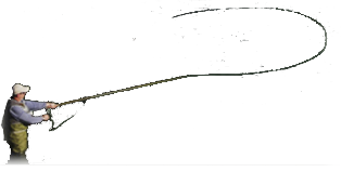
I'm with the others ...great as it is ...but since you asked I believe that the fly is too much of an eye catcher with the rather bright white wings...it takes away from your name which I think should be the eye catcher...just trying to be constructive.
With the comments about actual size for a rod I did a little size comparison. A 3/8" (0.375") diameter rod is approximately 1.17" in diameter. So I sized the graphic to a nickel, 0.875". I think it will work fine, you may want to lengthen it to allow rod data and date.
Attachment 11359
Good job Jesse. That took the guess work out of everything. Now we can clearly see that everything will work in perspective. Great job on the logo and yours is not the only one who married down but, I'm glad she did. Now get that first rod done so we can see the logo where it belongs and if it were me, the first rod would go to my wife with a nice inscription.
Scott
I think I would do this to it. I might check around and see if I can get a heat transfer on a tee shirt and/or a cap embroideried.
Attachment 11360
Keep in mind that the logo does not have to be wrapped around the rod horizontally. I can also be applied vertically. If you go the latter route, though, you might want to consider having the background color of the logo being a reasonably close match to the color of the finished rod.
I stand by my original post. Buy the flowers!
Order the cap.
Attachment 11361
Great feedback everyone. My wife is still working on it as this was her working concept. I like the addition of rod info and thanks to Jesse for getting the size figured out.